
Friday 8 April 2011


Thursday 7 April 2011


Evaluation question 4 - Final
My audience would be fairly typical for the alternative music genre. They would be interested in fashion and culture. Would often attend musical gigs/festivals. As it is aimed at a fairly young audience they would mainly be students from universities. The clothing these people would wear would be brands such as Edwin, Farah, adidas originals, reebok, Dr Denim and other vintage clothing. Music they would listen to be would be artists like Crystal Fighters, The Maccabees, Foals, The xx, The Strokes and other guitary/synth bands. Other interests would be Dj’ing, art and technology.
Evaluation question 5 - Final
To attract my audience, of young alternative people, on my front cover, I made sure that my masthead stood out. At first I had a font with quite thin letters, so making this wider made it stand out more, making it more aesthetically pleasing, which would result in a greater attraction Mentioning well known artists on the cover would also help to attract to fans as my target audience would be interested in these artists, giving the magazine a bigger draw. Also mentioning such a large festival such as Glastonbury will draw in and attract to the audience, as it is likely that members of my target audience would have been to the festival. Putting an appealing photo on was key, so using an attractive model helped to relate to the audience. Also, using the shadow feature helped as it adds a sense of mystery, making people want to read on, attracting the audience. The unique selling point for my magazine was that not only do you get a music magazine, you also get pictures to a high standard, which have a very artistic feel to them. People in my target audience are interested in art, so will find this a nice feature
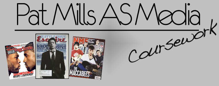
In my contents it was quite similar to the style of Esquire, which might not be a predominant music magazine, but has elements that I wanted to incorporate into my magazine. Members of my target audience will probably look at Esquire for fashion and art, so I felt that this would attract them well. Having a large page spread also will attract readers as they will be interested in some of the elements.
On my double page spread, I chose to have a simplistic feel, as when I have spoken to people who would be in my target audience, they said this was the best layout. Also the pose is similar to pop artists, so this would draw in another genre of audience. It is also fairly conventional for a music magazine, similar to a double page spread that Mojo or Q would run, making it fit in with the current market.
In addition to this I used the social networking site twitter and a small questionnaire to gain information on what my target audience would want from the product. The feedback I got was that they wanted a simplistic magazine, full with information. They also wanted to pages to look creative and be different compared with other music magazines.
After showing my friends, who would be part of the target audience my final magazine, their comments were;
- "I like the double page spread a lot, the positioning of the text boxes and the photo make it look realistic"
- "The contents is a bit messy, could do with tidying up. But other than that looks nice and realistic, could be a real magazine"
- "I like the front cover a lot, looks quite different, but would fit in well in a mag shop"


Subscribe to:
Posts (Atom)